OIL PAINTING TERMS
So, the Summer is starting to come to an end, and I imagine we are all starting to think about attending autumn workshops. Hopefully, we will soon be back up and running again at the studio for weekly painting workshops and morning masterclasses. If you would like to know: –
- when we are opening our doors; and
- the details for each oil painting workshop;
why not register your interest.
This week, before we start our beginners guide to the SECONDARY COLOURS, we are taking a very quick look at some of the ‘lingo’ / glossary of terms surrounding oil painting.
Hopefully, with this knowledge you will never feel like a stumbling fool in a painting workshop, wondering WHAT THE HELL ARE THEY ALL TALKING ABOUT. So, if you are like me and cannot retain lists or read technical jargon – I have just started with the first 5 painting terms and over the next few months, we will cover 5 painting terms at a time, so that this way it will stay in our heads!!
Here we go for the main painting terms that are often bandied about…
HUE
So the first painting term is Hue.
All this is, is the name of a colour – of which there are 6no.: –
- RED
- VIOLET
- BLUE
- GREEN
- YELLOW
- ORANGE
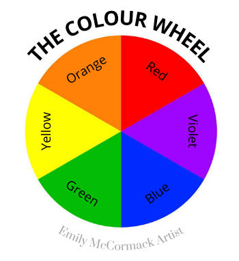
Black and White are known as ACHROMATIC colours, which is colours without colour!
VALUE/TONE
The next painting term is Value/Tone. So, Value/Tone is the relative degrees of greyness (darkness or lightness) from black to white.
Basically, the lightness or darkness of a colour. For example, even though the same hue or colour: –
Lemon Yellow is lighter than Cadmium Yellow Deep.
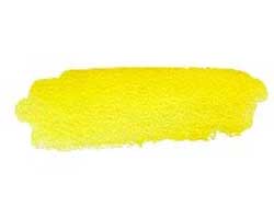
LEMON YELLOW

LEMON YELLOW
Cerulean Blue is lighter than Prussian Blue.

CERULEAN BLUE
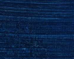
PRUSSIAN BLUE
The easiest way to know the value of a colour is to take a photo of it and convert it to a black and white image and that will give you the greyscale.
As a quick GUIDE, for colour value is as follows if the scale is darkest is 1 and the lightest is 10 (Note – it’s different for the US and Europe): –
| Value | Temperature | ||
|---|---|---|---|
| RED | Alizarin Red Cadmium Red |
2 5 |
Cool Warm |
| VIOLET | Dioxazine Purple Cobalt Violet |
2 3 |
Cool Warm |
| BLUE | Cerulean Blue Ultramarine Blue |
4 2 |
Cool Warm |
| GREEN | Viridian Green Sap Green |
2 2 |
Cool Warm |
| YELLOW | Lemon Yellow Cadmium Yellow Deep |
8.5 8 |
Cool Warm |
| ORANGE | Raw Sienna Cadmium Orange Deep |
5 6 |
Warm Warm |
CHROMA/COLOUR INTENSITY OR SATURATION
The third painting term is Chroma/Colour intensity or saturation.
This is just the brightness or dullness of the colour or painting. So, for instance: –
- Cadmium Yellow Pale is more intense (brighter) than Yellow Ochre.
- Cadmium Red will become less intense as white is added in that it becomes Pink.
In terms of paintings – if we take a Whistler nocturnal painting and compare it to the following painting by André Derain you should get an instant understanding of Chroma / Saturation: –
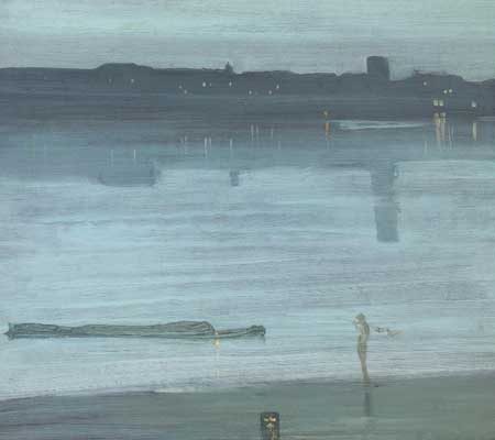
EXAMPLE OF LOW CHROMA / SATURATION
NOCTURE: BLUE AND SILVER – CHELSEA
James Abbot McNeill Whistler
(1871)
HELD IN THE TATE GALLERY, UK
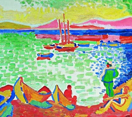
EXAMPLE OF HIGH CHROMA / SATURATION
BÂTEAUX DANS LE PORT DE COLLIOURE
André Derain
(1905)
HELD IN PRIVATE COLLECTION
LOCAL COLOUR
The fourth painting term to look at is Local Colour.
This is simply the true colour of the subject matter as seen in natural light – a red or green apple, a blue sky, green grass without the influence of lighting, shading or the mind’s perception.
ATMOSPHERIC EFFECT
The fifth painting term is atmospheric effect, this is how the atmosphere affects the view. So, a red roof might appear purple in the distance, the sky might be violet or rose colour due to the sun, pollution, dust and/or rain.
Other painting terminology that we will cover in future oil painting blogs will include primary light source, indirect light, tints, shades, tones, relativity, negative space, alla prima, chiaroscuro, grounds, composition, gesso, sfumato, texture, blending, camera obscura, perspective, focal points, colour bias underpainting, opaque/transparent, massing or blocking in, rheology, scumbles, impasto, grisaille, direct painting etc. If there are any art terms you would like me to explain in any of our future painting blogs – just send me a message.
In our next Blog, we will begin our journey through the Secondary Colours, commencing with the colour Green then Violet and finally Orange.
Until then stay safe and keep painting.
Emily McCormack
2021
Become an insider, subscribe to receive
Stunning previews of new art, discounts, painting tips and early booking for painting workshops.


