Introduction
Welcome to this month’s Oil Painting Blog for Beginners. *
Apologies, we had promised this blog a few months back, but we were having trouble with the initial design illustrations, so we reached out to ‘The Color Wheel Company’ who have very kindly granted us permission to use the front and rear images of their colour wheel which are perfect for this three-part oil painting blog which will be broken down into the following parts:
- Part 1 How to use the Front of the Colour Wheel
- Part 2 How to use the Rear of the Colour Wheel (coming soon)
- Part 3 Using the Colour Wheel for Colour Mixing – tips for getting it right every time (coming soon)
Let’s get started: –
PART 1 HOW TO USE THE FRONT OF THE COLOUR WHEEL
As, previously mentioned above, we will be using the ‘Color Wheel’, which can be purchased from most good art stores and comes in three sizes as follows:
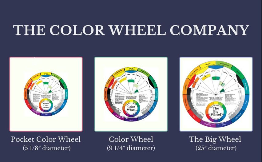
Here at the downstairs studio, we use the 9 ¼” diameter Colour Wheel and most of the students carry the pocket Colour Wheel in their oil painting kit.
We also use our own colour wheels, which we have included as a free download on this link:-
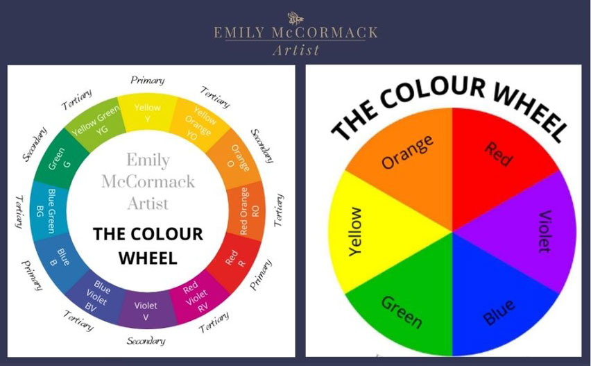
The front cover of the ‘Color Wheel’ is very handy in that, first of all, it lists as a reminder, what the Primary, Secondary and Tertiary colours are and how they can or cannot be made.
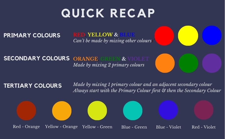
Secondly, at a high-level view, it explains some key colour terminology as follows: –
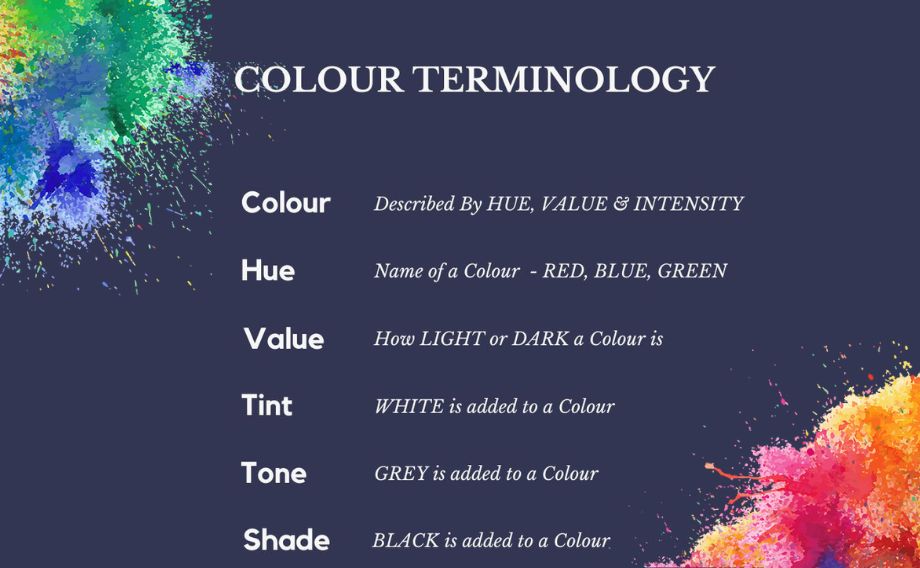
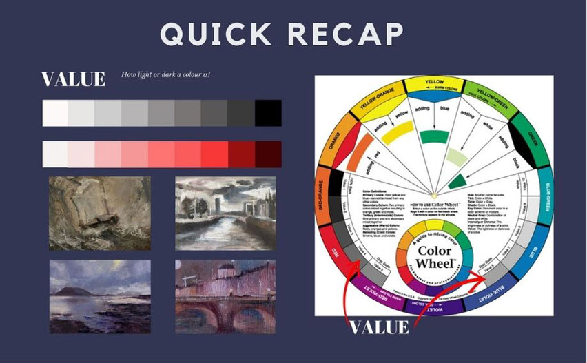
Most of their Colour Terminology is easily understood and self-explanatory. However, we have also included a ‘quick recap’ on Value for you below.
As you can see in the second image, the ‘Color Wheel’ also includes a Value Scale on the inner dial which is a grey scale from Value 1 (100% Black) to Value 10 (100% White).
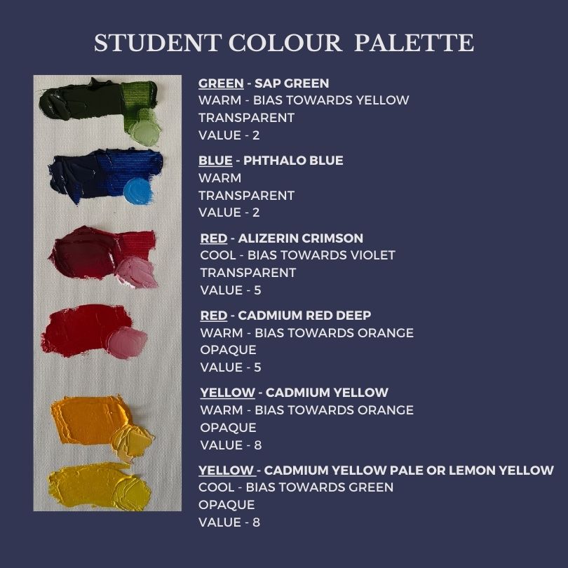
To give you an idea what values certain colours are, we have included the colour palette that our students start off with here at the studio. Typically, yellows will be value 8, reds a value 5 and blues, greens and violets a value 2.
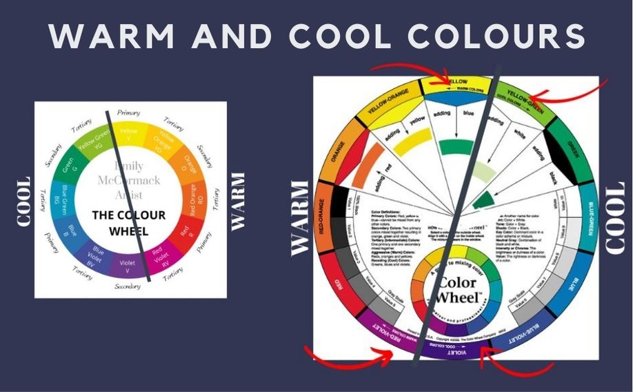
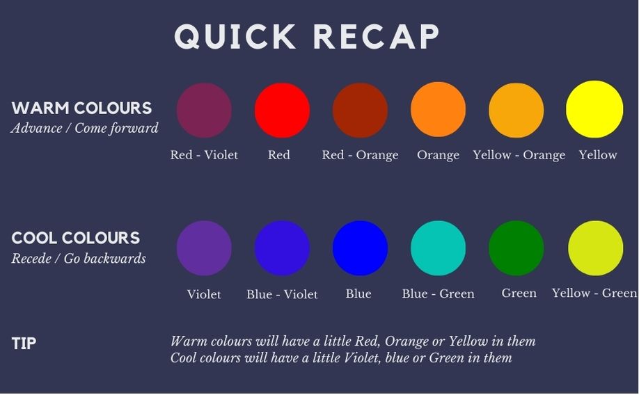
The ‘Color Wheel’ also notes what colours are warm and what colours are cool.
So, if you, look at the outer perimeter of the ‘Color wheel’ at the axis between Yellow and Yellow-Green at the top and Violet and Red-Violet at the bottom you will see an arrow going left for warm colours and right for cool colours.
For ease of reference, the extended list is as follows:
- Warm Axis Red-Violet, Red, Red-Orange, Orange, Yellow-Orange & Yellow
- Cool Axis Voilet, Blue-Violet, Blue, Blue-Green, Green, Yellow-Green
We have also included a visual ‘quick recap’ for you.
Finally, the ‘Colour Wheel’ has on one half of its inner moveable dial the following:-
- The Primary Colours – Red, Yellow, Blue,
- White,
- Black, and
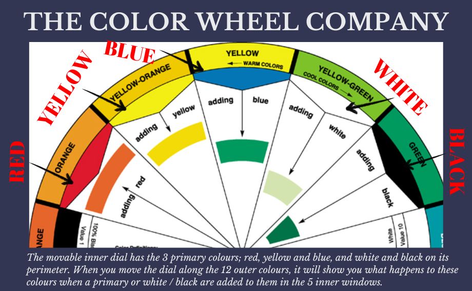
- Little cut out windows to show the colour made when mixed with the primary’s, white or black and the 12 colours on the perimeter of the main wheel / disk.
So, if we take Red, in the image below it shows ORANGE, RED and then in the open window a RED – ORANGE colour which is to represent what happens when red and orange are mixed together.
You can move the inner wheel around each of the top colours and in this Window 1, it will show you the colour you will get when mixed with red.
This won’t be an exact replica of actual colours you are mixing, or hoping to mix, but it’s a helpful high-level guide to direct you in the right direction.
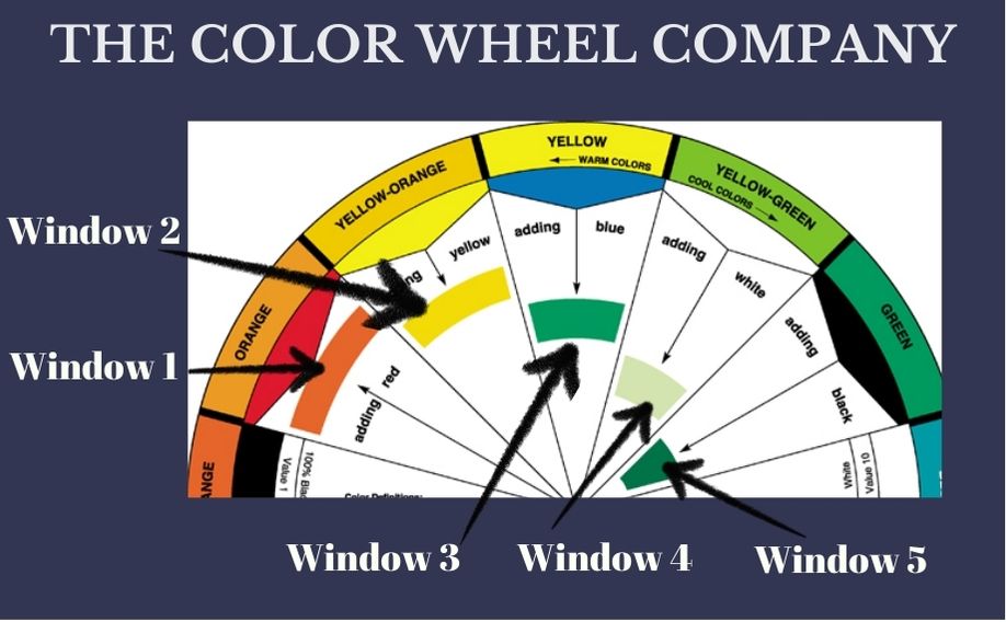
You can do the same for Yellow, Blue, White and Black and the combinations will be seen in the remaining 4 windows as shown in the image below: –
Yellow + (Yellow – Orange) = Bright (Yellow – Orange) (Window 2)
Blue + Yellow = Green (Window 3)
White + (Yellow – Green) = Pale Green (Window 4)
Black + Green = Dark Green (Window 5)
So that’s it for the front of the ‘Color Wheel’.
We hope that this provides a clear and easy guide, and we suggest that to get the full benefit of this blog to have the ‘Color Wheel’ or indeed any colour wheel in your hands as you read through the blog.
You may find these previous blog posts give a useful insight on colour too:
- The Art of Colour Mixing – 6 Key Tips for Oil Painting
- Is Black a Colour
- Shades of White
- Lets Talk Orange
- 5 facts about the Colour Purple or is it Violet
- Lets Look at Green Oil Paint
- A beginners guide to the primary colours – Yellow, Blue and The Colour Red
- Oil Paint colour mixing – 5 top tips
THAT’S IT FOLKS FOR THIS MONTH……
Until next month, when we will continue our oil painting journey.
Wishing you nothing but the very best of wishes and a great St. Patrick’s Day and Easter Break!
Emily
March 2024
* As always, I am not affiliated with any brands, stores, or persons I may or may not mention and your use of any of these products, links and the like are your own risk and it’s up to you to do your research/homework before you use them. This is just my opinion and experience.
Become an insider, subscribe to receive
Stunning previews of new art, discounts, painting tips and early booking for painting workshops.


