Introduction to the Art of Colour Mixing
Welcome to this month’s Oil Painting Blog for Beginners. *
The art of colour mixing, is a complex process. For the Beginner artist, it can be a difficult and mysterious skill to master. However, within this issue, we hope to remove some of the mystery for the beginner and provide a few clear guidelines to ensure successful colour mixing every time.
Tip 1 – Work With A Limited Colour Palette
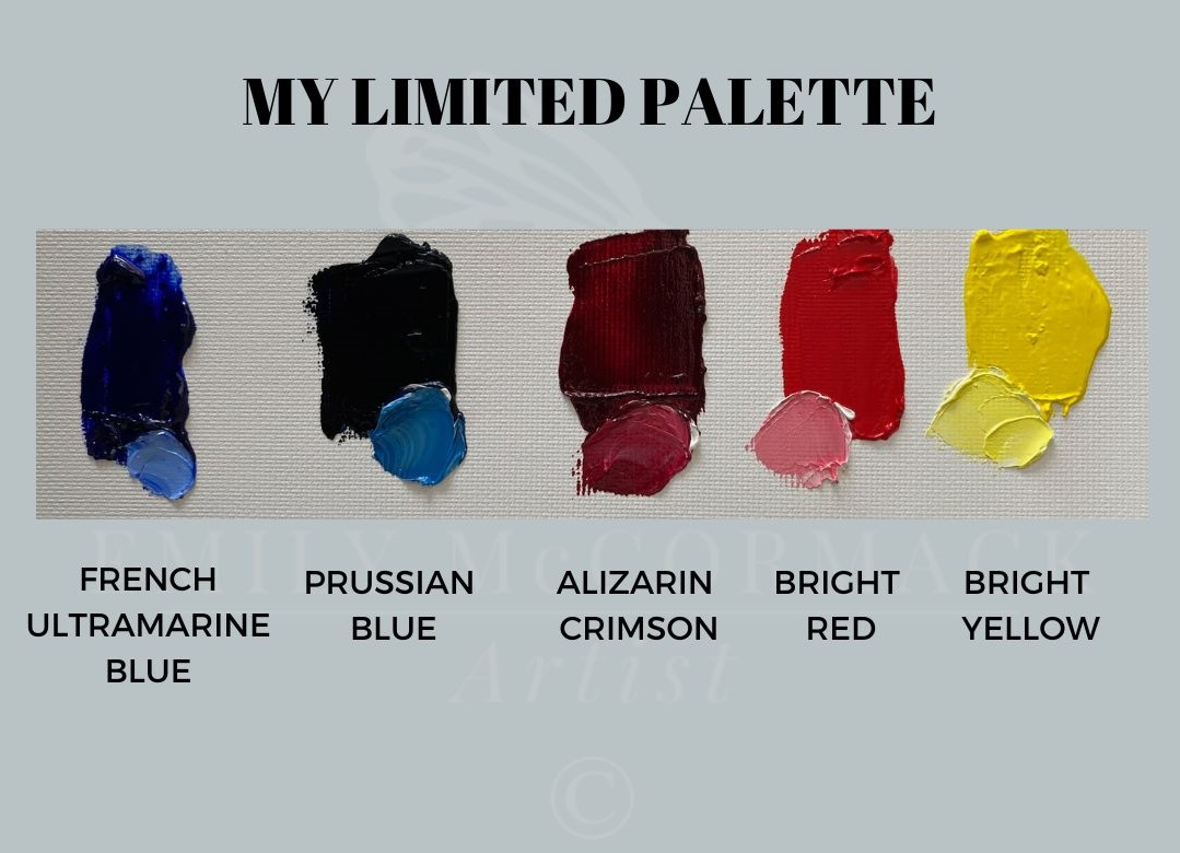
A limited colour palette is usually working with three to five colours and perhaps Titanium White and Ivory Black.
Normally, if I’m working with a limited palette, it will consist of two blues, two reds and a yellow as follows:
At the school, the students start off with Titanium White and Ivory Black. This allows them time to learn to mix and create various shades from just two colours. (See tip 2 for a further note on black and white.)
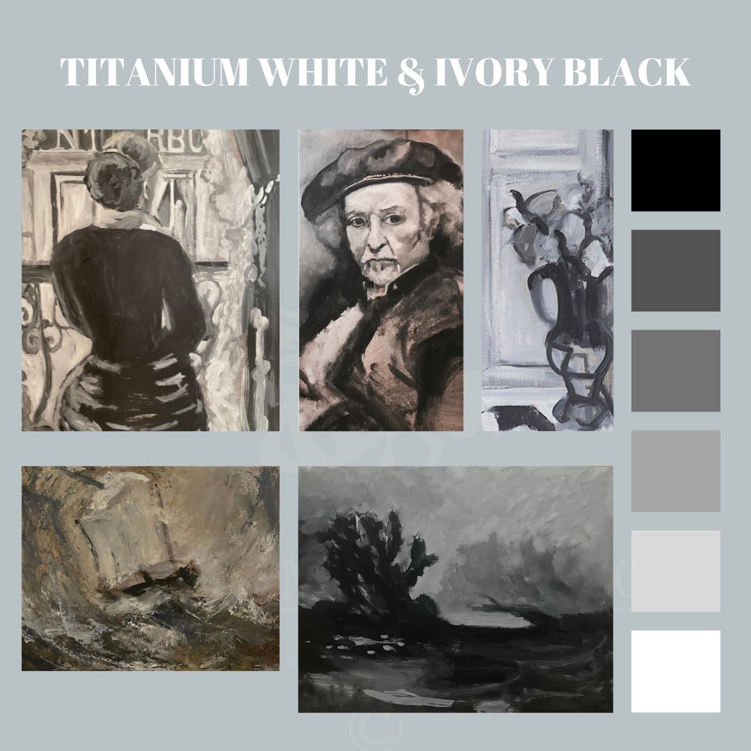
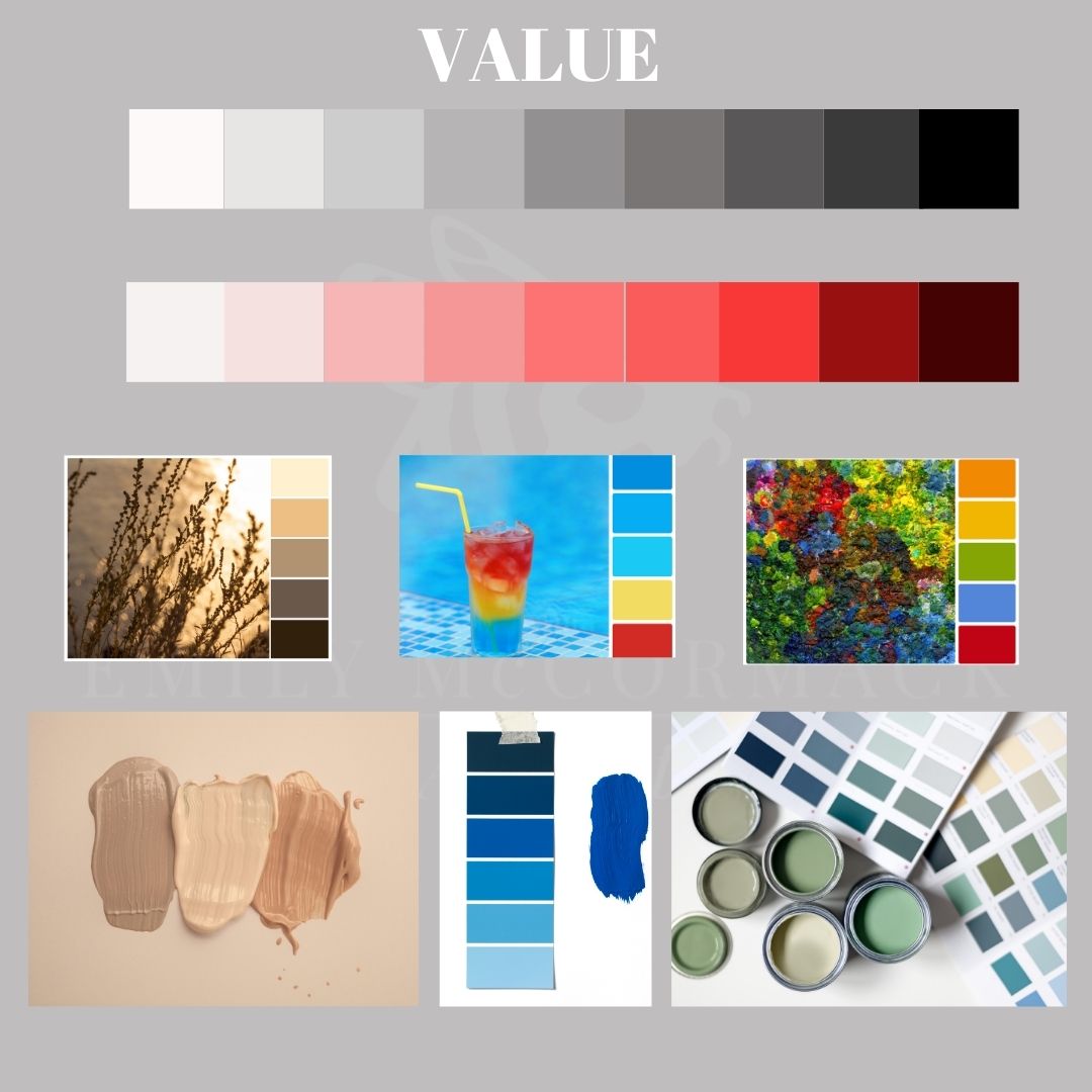
These shades are known as values, which is basically how light or how dark a colour is.
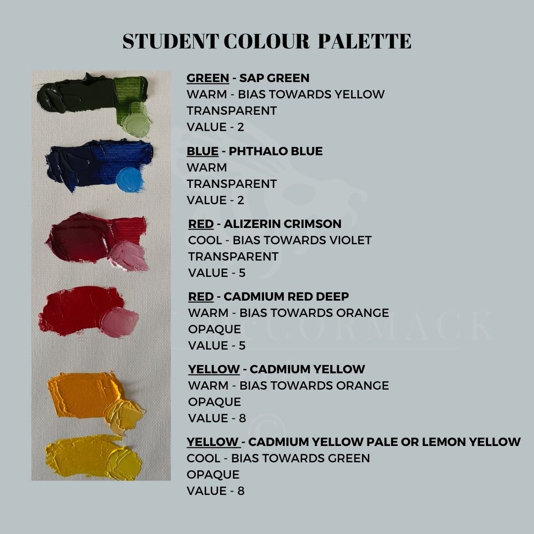
After week one, the student’s palette is extended to include the following colours – Lemon Yellow, Cadmium Yellow Medium, Alizarin Crimson, Cadmium Red Deep, Phthalo Blue and Sap Green.
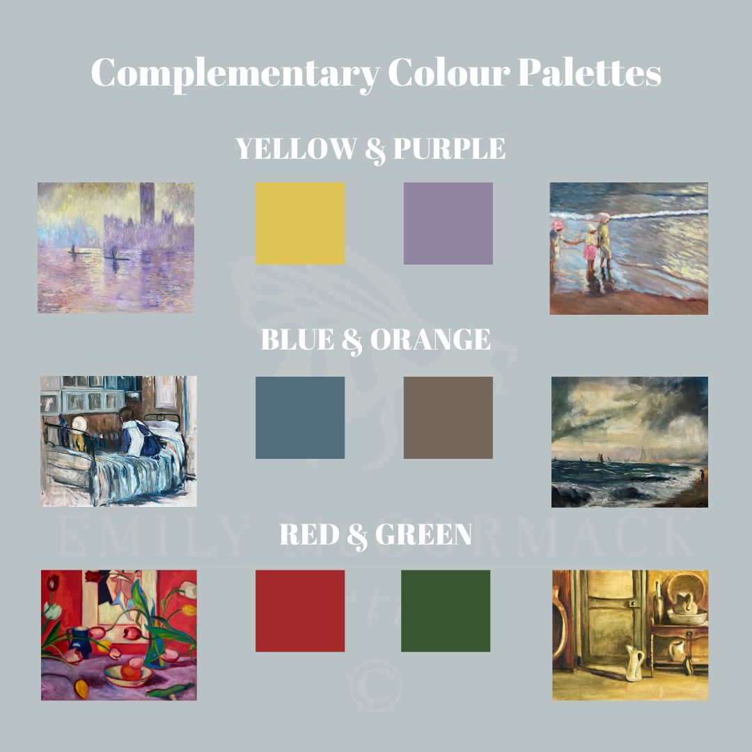
Then after a time, they move on to different colour palettes, for example, complementary colour palettes (colours opposite each other on the colour wheel) were used to create some of the following: –
By working with a small number of colours, akin to the students here at the school, over a period of time, you will get to see and understand the particular characteristics of each colour, its shades and:-
- how it mixes with white (tints) and black (shades),
- to know if it’s a warm or cool colour,
- how to manage transparency and opacity,
- how to brighten and darken the colour without using white or black.
In addition, your eye muscle has time to learn these shades of colour, which it can then easily identify whether you are doing a study of another painting, painting from a reference photograph in the studio or painting on location – plein air style.
Tip 2 – Learn To See Colour Bias When Mixing Colour
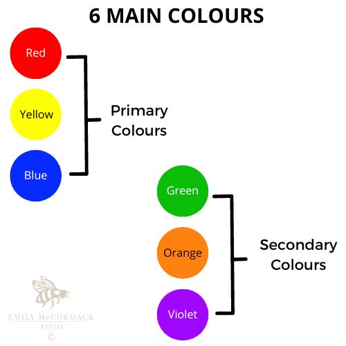
There are six main colours/hues in oil paint: –
However, there are many shades for each of these colours.
To get a high-level understanding for just how many shades there are for each colour refer to our blogs on red, yellow, blue, green, orange, violet and indeed black and white.
Just a note on: –
- BLACK AND WHITE
Neither are deemed a hue or a colour.
Instead, they are known as achromatic’s, as they are not true colours given that they often have a tinge or bias towards one of the above hues. For example, if you add a little white to ivory black you will note it has got a bias towards blue. If you get a black marker and add water onto a mark you have made on a piece of paper, you will see a different colour run from the water mark – very often it will be slightly violet/purple.
- BROWN
All browns are known as oranges and that is how they are represented on the Colour Wheel. Here at the school, we get the students to mix various shades of the primary colours to see how bright or dull they can mix the secondary and tertiary colours.
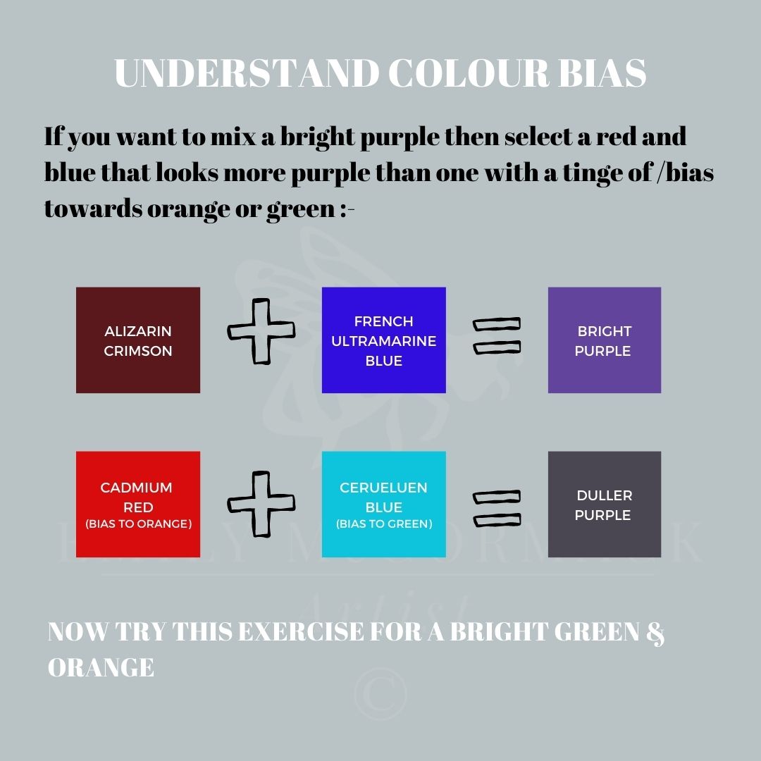
So, in the above example, cadmium red and cerulean blue have very little purple in either of them, so it’s going to give you a duller purple.
For bright colours, really bright ones, your best and only bet is from a tube of paint.
If you want a really bright vibrant orange, then you would go for a Cadmium Orange which you can then vary the intensity or chroma by mixing it with a yellow orange such as a Cadmium Yellow Deep and/or a red orange such as a Cadmium Red.
However, if you want to mix an orange colour, say a bright orange then you could try mixing Cadmium Red with Cadmium Yellow Deep and for a duller orange, Alizarin Crimson with Cadmium Lemon Yellow. Try mixing various reds and yellows together to see what oranges you can make.
Based on the principles above see if you can mix a bright green or indeed find a tube of very bright green on the market.
If you are still having trouble with green, as some students here at the school have, and have described it as their nemesis, we will be doing a follow-on blog dealing solely with mixing greens in the coming months.
Tip 3 – Consult Your Colour Wheel
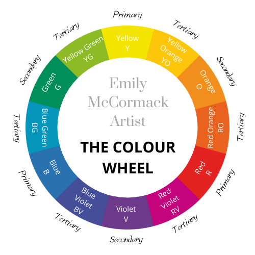
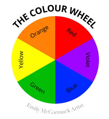
The colour wheel is not a fix-all for mixing colour. However, it is a handy tool for you to refer to when asking yourself where the colours you are thinking of mixing lie in relation to the colour you want to make.
For instance, you want to make Violet, then a blue that is a blue violet and a red that’s a red violet is going to give you a brighter violet, than, a blue that is more blue-green and a red that is more red-orange.
Basically, the closer the two colours you are mixing, are to the colour you want on the colour wheel, then, the brighter the colour you are going to get from your colour mix. So, the further away on the colour wheel, the two colours you are using in the mix from the colour you want to make, then the duller your mix colour will be!
Tip 4 – Don’t Mix More Than 2/3 Colours
Generally, for clear colour mixes instead of muddy mixes, try to stick to two colours.
So, you can mix as many blues and yellows together but if you add in a red, orange or violet into the mix you will get a darker muddier colour. The same rule applies to reds and oranges and blues and reds.
Tip 5 – Watch The Existing Colours On Your Painting
Colours that are next to each other on the canvas/painting board can have a direct impact on each other including making the colour more or less vibrant or changing the colours overall temperature.
For example, in the image below you will see Emerald Green – in each example the same strength of Emerald Green is used – just straight from the tube.
However, when the Emerald Green is placed beside the bright purple (Quinacridone Magenta) it pops and is very vibrant and it looks warm. Whereas it’s less intense/duller and appears cooler, when placed beside the warm red violet (Alizarin Crimson and Ivory Black).
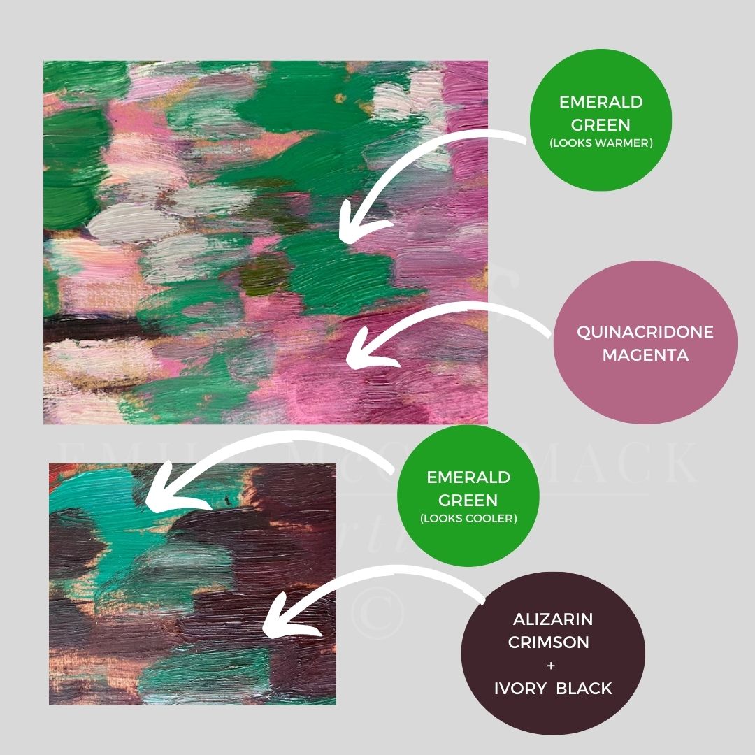
We will do more on this in future blogs.
Tip 6 – Artist Professional Oil Paint vs Student Oil Paint
If you are starting off as a beginner, I would suggest using Winsor and Newton’s student brand of oil paint, known as Winton. The colours are pretty true and they are much cheaper than artist quality.
After time, you can start to replace each colour with an artist-quality oil paint, there are many brands on the market to choose from including Winsor & Newton, Gamblin, Michael Harding, Old Holland, Sennelier and Williamsburg.
There is a difference between artist and student-grade paint and the vibrancy when mixing colour. This is because there is more pigment in the artist-grade paint than the student grade.
In the following example, I have taken lemon yellow from Michael Harding (artist grade) and Winton (student grade) and you should see that the colour mixes with the artist grade are brighter than the student grade, even though, the lemon yellow used is actually visually duller than the student grade lemon yellow.
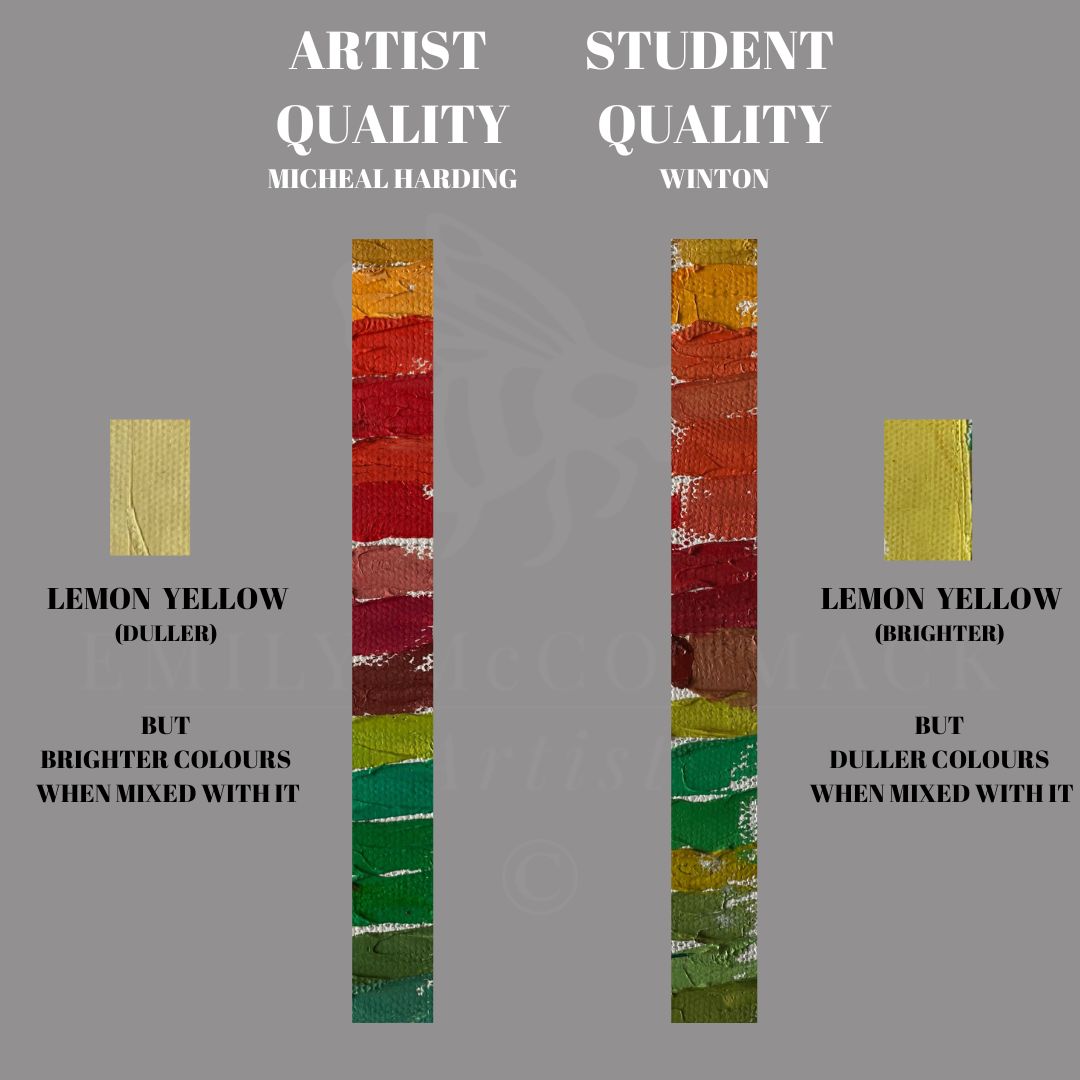
Now, don’t go thinking you have to spend a fortune for artist quality oil paint. There’s a brand of artist quality Chinese Orange out on the market over €50 for a tube. It’s really vibrant, but it is also very difficult to use. When it touches or is mixed with any shade of blue, it turns a dirty green that’s impossible to use and indeed remove from the canvas/board!
So, if you are just starting out, check out our material list and start off with the student quality brand until you get very good at mixing colour. Then it’s time enough to extend your palette to include artist-quality oil paint.
That’s It Folks For This Month……
So, the key questions you want to ask yourself when starting to mix colour, is, what’s it’s: –
- HUE/COLOUR? – Is it RED, YELLOW, BLUE, GREEN, ORANGE or PURPLE?
- VALUE? – Is it light, dark, where does it lie on the value scale?
- CHROMA? – Is it bright or dull?
We will be doing more blogs on colour mixing and colour theory over the coming months including, colour temperature, how to lighten and darken your colours without using black or white and how to read the colour wheel!
If you would like to learn more about painting in oils, getting started in oils or colour theory for beginners and want to attend our studio then feel free to sign up for one of our upcoming workshops. For heads up on when we are releasing our new colour workshop part 1 for beginners then click the link to sign up for our monthly newsletter.
Until next month, when we will continue our journey into the world of colour theory for beginners.
Wishing you nothing but the very best of wishes and a great summer!
Emily
July 2023
* As always, I am not affiliated with any brands, stores, or persons I may or may not mention and your use of any of these products, links and the like are your own risk and it’s up to you to do your research/homework before you use them. This is just my opinion and experience.
Become an insider, subscribe to receive
Stunning previews of new art, discounts, painting tips and early booking for painting workshops.


