At the start of the week, I was thinking how the hell does one write a blog on Orange, my very least favourite colour on the colour wheel. I’m not sure if it was the change in seasons that had me in the dumps, with little vision for anything let alone THE COLOUR ORANGE. But then yesterday, I was out in the garden and there were so many shades of orange, which, let’s face it – is the colour of autumn. Then, I watched a YouTube recording of this year’s Chelsea Garden show and my love affair with Orange was re-kindled, through the deep warm shades of ranunculi’s, marigolds, nasturtiums, dahlias and the good old pumpkin.
So, LET’S DIVE IN and take a BEGINNER’S LOOK AT THE COLOUR ORANGE…
ORANGE – THE INTRODUCTION
Orange, the last of our secondary colours is made when you mix equal quantities of Yellow and Red, the two primary colours, together. When I think of Orange, movies like Clockwork Orange, prison jumpsuits, the Golden Gate Bridge, Terry’s Chocolate Orange, the Orange Order, Hermes and orange traffic lights, all spring to mind. A lot of the time, it’s seen as a WARNING type colour.
In his book Concerning the Spiritual in Art (1911) Kandinsky, the Russian abstract artist wrote that: –
“Orange is like a man, convinced of his own powers.” (Palumbo, 2018 : Artsy)
It’s been used since prehistoric times. The Egyptians used what we now know as realgar to adorn their dead and here on the Celtic Isle of Ireland, orpiment was used in the Book of Kell’s. It was pretty toxic as it contained arsenic.
Then, in the early 1800’s a synthetic orange called Chrome Orange was developed from a mineral known as Crocoite. It was a favourite colour of the IMPRESSIONISTS including Monet who used it in his painting Impression: Sunrise which we touched on in our last blog on the colour Purple. The idea was that, orange when used alongside the Impressionists various shades of blue, primarily, cobalt and azure blue, would enhance both colours. (Meller, Art & Collective, 2020)
In this blog, we are only going to look at Orange, but please bear in mind that your burnt and raw umbers and sienna’s are also shades of Orange but we will deal with them separately in a future blog.
THE SHADES OF ORANGE
The colour orange is located on the colour wheel between yellow and red, as both these colours when combined make up Orange.
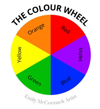
Its compliment is blue which is located directly across from it. So, if you want to dull or desaturate your blues just add Orange to it. If you want to warm up a cold red like alizarin crimson or a lemon yellow just add some orange to it. Test it as you go.
To practice your colour mixing and colour placement, you could get yourself a 12 segment colour wheel, where you could try different colour plans such as: –
- Blue (B) and Yellow Orange (YO) and Red Orange (RO); or
- Orange (O) and Blue Green (BG) and Blue Violet (BV);
which are both known as Split Compliments.
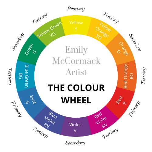
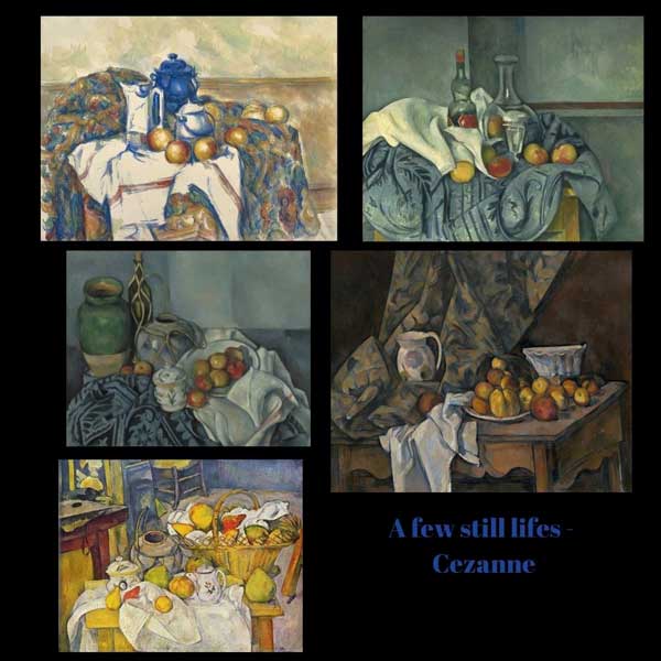
These colours would be a great colour plan for a still life of fruit and say jars, cups or bottles. For ideas check out some of Cezanne’s still life’s below.
The following are some of the Oranges currently on the market.
I’ve pretty much used them all, but I tend to use, mostly: –
- Cadmium Orange;
- Transparent Orange or – Transparent Earth Orange; and
- Windsor Orange.
I also keep a large tube of Cadmium Orange Deep to hand to warm up colours.
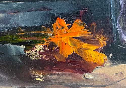
In the extract image below, taken from a floral painting I did a while ago, you will see how well Cadmium Orange can work with Alizarin Crimson.
If a painting is not working out to well, I’ll always leave it for a little while and when I come back to it I’ll try a glaze of Transparent Orange or Transparent Earth Orange and a small amount of medium (such as Gamsol Galkyd, linseed or walnut oil or neo megilp).
In this painting, I used it to create a little glow in this rather dark oil painting.
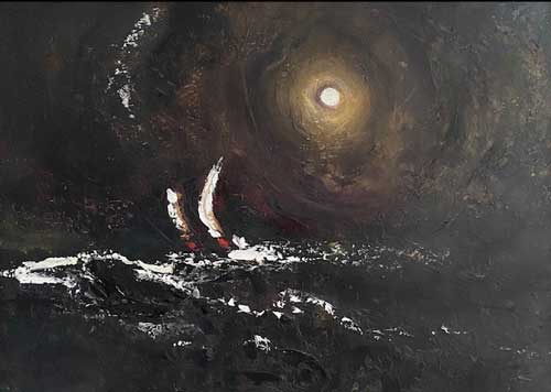
REMEMBER the more glazes you apply the darker your painting is going to be.
Just to also note, that Cadmium Orange and Winsor Orange when either of them are mixed with Titanium White they can produce some lovely shades of pink!!
TABLE OF ORANGES
Below is a list of some of the oranges available on the market. One orange, I have not included in the list, is Sennelier’s Chinese Orange – which, came highly recommended to me, but I found having purchased and used it – that it is very difficult to use alongside blues, and it seemed to catch them and turn them a funny shade of green which I admit I failed to have the skill to control.
Gamblin
- Cadmium Orange
- Cadmium Orange Deep
- Permanent Orange
- Transparent Orange
- Transparent Earth Orange
Old Holland (extra to the above)
- Schevenings Orange
- Cad. Yellow Orange
Winsor Newton – Artist (extra to the above)
- Windsor Orange
The information above was extracted from K&M Evans Art Website* and I have not included Michael Harding oil paints as the names are already accounted for in Gamblin listed above. However, do check out Michael Harding oil paints – they are lovely paints to use – especially, his Umbers, Prussian Blue, Bright Greens etc.
ORANGE VALUE & TEMPERATURE GUIDE
Value guide – 1 is the lightest and 10 is the darkest.
| Colour | Value | Temperature |
|---|---|---|
| Transparent Earth Orange | 2 | Warm |
| Transparent Orange | 4 | Warm |
| Cadmium Orange Deep | 6 | Warm |
| Permanent Orange | 6 | Warm |
| Cadmium Orange | 7 | Cool |
ARTISTS WHO USED ORANGE
“Artists like Monet, Gauguin, Renoir, and Toulouse-Lautrec used the colour to great effect. Monet incorporated orange into his sunsets, while Toulouse-Lautrec used the colour to symbolize the frenetic energy of Parisian dance halls. But perhaps no other painter was as indebted to orange as Vincent van Gogh. Van Gogh would mix his own orange hues and use them to contrast with the blues and purples he incorporated into his work”. (Stewart, 2019 – My Modern Met)
A few other artists who used orange included:
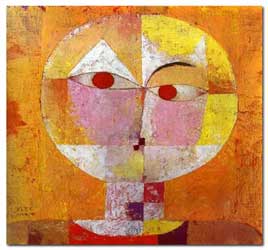
Senecio
(1922)
Paul Klee (1879-1940)
Kunstmaseum Basel, Basel
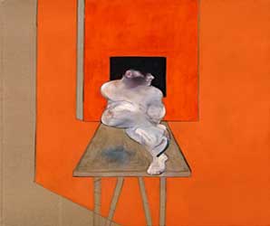
Study of a male body
(1986)
Francis Bacon (1909 – 1992)
Private collection
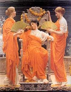
Midsummer
(1887)
Albert Joseph Moore (1841-1893)
In our next blog, in two weeks’ time, we will be looking at the Shades of White, thereafter the Shades of black. Then, we will be in for a change of topic and pace.
Over the next few months, we are also gradually opening back up the studio for workshops – if you would like to be kept informed as to the timetable and workshops on offer feel free to subscribe to our waiting list.
Until then stay safe and keep painting.
Emily McCormack
2021
* As always, I am not affiliated with any brands, stores, or persons I may or may not mention and your use of any of these products, links and the like are your own risk and it’s up to you to do your research/homework before you use them. This is just my opinion and experience.
Become an insider, subscribe to receive
Stunning previews of new art, discounts, painting tips and early booking for painting workshops.


