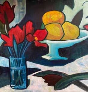
OIL PAINT COLOUR MIXING – 5 TOP TIPS
Welcome once again to Emily McCormack-Artist’s blog on all things Oil Painting.
So, you now have your painting kit, know how to lay out the painting palette, and are ready to start mixing paint. But, instead of vibrant and intense colour, you are getting dull grey or brown mixes or worse still, you have a fear of mixing or haven’t a clue where to start!!
Well, this week, beginners, you are in luck, as we are taking a look at my 5 top tips for colour mixing. *
TOP TIP 1 – MIXING YELLOW AND WHITE
This is an easy way to start, from your tube oil paint squeeze out some Titanium White and some Cadmium Yellow on to the edge of your painting palette. It doesn’t matter if it’s Cadmium Yellow – Light, Lemon, Medium or Deep.
Now, take some Cadmium Yellow and place it in the middle of your palette. You can use a brush or palette knife to do this. Then, clean your brush or palette knife and scoop up some Titanium White. Mix the Titanium White with the Cadmium Yellow to get a lighter yellow colour. What you should find, is that you need an enormous quantity of Titanium White to lighten up the Cadmium Yellow.
Whereas, if you place the Titanium White first and then add a very tiny amount of the Cadmium Yellow you will instantly get the lighter yellow colour.
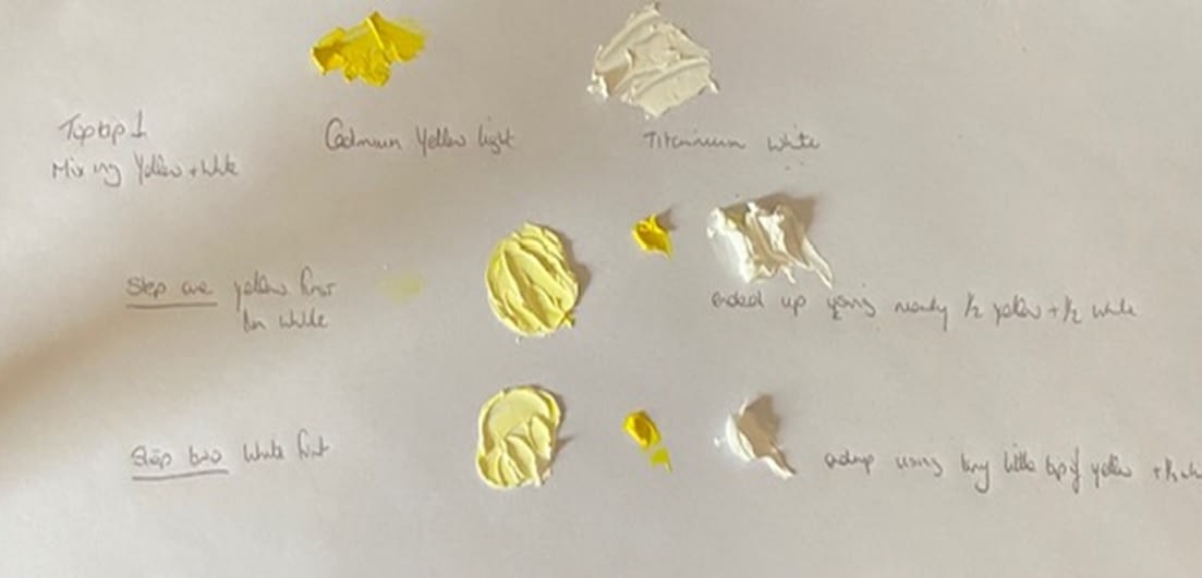
So, Top Tip 1 – place the white first and then the colour.
TOP TIP 2 – HOW TO LIGHTEN UP YOUR COLOURS WITHOUT USING WHITE
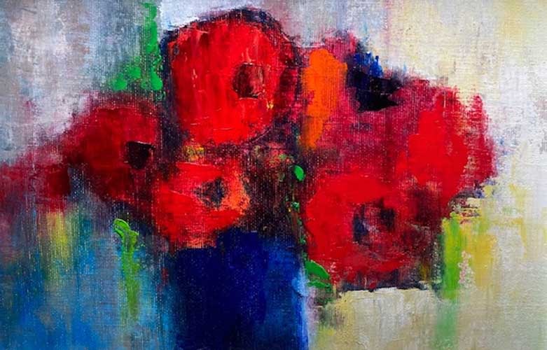
White is great for lightening up colour, especially say, Sap Green or Alizarin Crimson. This is called creating a tint. White also helps to bring out the true colour of the paint and can strengthen or harden your paint colours. It can also create vibrant colours if used with modern pigments such as Phthalo Blue. In the painting below, I used a black gesso background and mixed Titanium White into the paint mixes to help intensify the colours.
However, if you are a beginner and are adding Titanium White to your mixes from the start of the painting and/or are using it consistently, you will find that it can dull your paint mixes and overall painting, leaving it looking sort of chalky.
So, instead if you want to lighten or make your colours more vibrant try the following. To lighten/brighten a:
- Red – add a warm or cold yellow.
- Blue – add a warm or cold green.
- Green – add a warm or cold yellow.
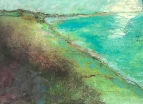
Another way to lighten or intensify your paint colours is to thin the paint with oil painting mediums as I have done in the seascape below.
You can also use final transparent glazes to intensify the colours you have already placed on your painting which has dried. We will be looking at final glazing in future blogs.
TOP TIP 3 – HOW TO DARKEN UP YOUR COLOURS WITHOUT USING BLACK
Black is an extremely useful colour. You can get Ivory Black, Lamp Black and Mars Black. I generally only use Ivory Black as I find it is a richer and more transparent black than the other two.
We have all heard of Monet declaring that he never used black in his paintings and since then there has been an open debate on whether you should use black. Here, in the Painting Workshops in level 2 and 3, we look at how black can affect a painting. In both of these quick little studies, if straight black is used, it immediately dulls both paintings. Whereas, if we use, say a mixture of Prussian Blue and Alizarin Crimson or Phthalo Green and Blue for the lines this helps to intensify the colours rather than dulling them.

After Van Gogh
After Peploe
Also, you can darken a colour and keep a richness in the mix by adding the Complement Colour to your chosen colour. The Complement Colour is the colour directly opposite your chosen colour on the colour wheel as follows:
- Red add Green
- Blue add Orange
- Yellow add Violet
TOP TIP 4 – MIXING COLOURFUL GREYS
For a painting to shine, you need quite dull colours which in turn will allow your vibrant/strong colours to shine. All greys are made up of the 3 primary colours – Red, Blue and Yellow.
So, following on from Top Tip 3, if you mix the Complementary Colours above and add various amounts/degrees of Titanium White you should get some lovely greys as follows:-
| Primary Colour | Complementary Colour | Examples you will need to vary the mixes and you can also add Titanium White |
|---|---|---|
| Blue | Orange (Red and Yellow) | Ultramarine Blue + Burnt Sienna |
| Red | Green (Blue and Yellow) | Alizarin Crimson + Sap Green |
| Yellow | Violet (Red and Blue) | Cadmium Yellow Med + Dioxazine Violet |
Other sets of colours to play around with, could include: –
- Phthalo Blue, Quinacridone Magenta, Cadmium Yellow and Titanium White.
- Cobalt Blue, Alizarin Crimson, Viridian, Cadmium Orange and Titanium White.
TOP TIP 5 – THE ULITMATE KEY TO COLOUR MIXING
The key is to always ask yourself, what is the colour bias? That is, which way the colour leans more towards.
For example, say it’s a:-
| Red | Cadmium Red Light leans more towards Orange; whereas; Alizarin Crimson leans more towards Violet. |
| Blue | French Ultramarine Blue leans more towards Violet; whereas:- Cerulean or Manganese Blue leans more towards Green. |
| Yellow | Cadmium Yellow Medium leans more towards Orange; whereas:- Cadmium Yellow Lemon leans more towards Green. |
So, if we want to mix Green that is Blue with Yellow: –
- if we take Cerulean or Manganese blue and Cadmium Yellow Lemon which both lean towards Green then when we mix them both together the yellow and blue part of the colours are cancelled out by each other and we are left with a bright green as shown below:
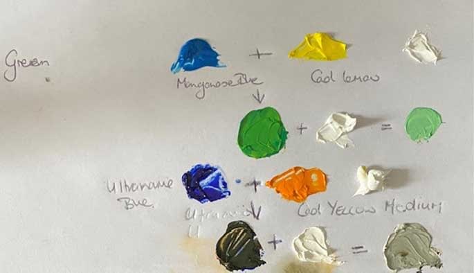
- If we take French Ultramarine Blue which leans towards Violet and has more Violet than Green when compared to the Manganese Blue (above) and we add this to Cadmium Yellow Medium which contains more Orange than Green unlike the Cadmium Lemon Yellow (above) you are left with a duller more olive green. This is because there is very little of the green bias in either the French Ultramarine Blue or the Cadmium Yellow Medium.
So, that’s the trick, you look at the colour bias to see which way the colour leans. If you want a more intense and colourful violet, you would mix Ultramarine Blue and Alizarin Crimson as they both lean towards Violet. If you want an intense orange, you would mix Cadmium Yellow Medium and Cadmium Red Light as they both lean towards Orange.
I hope these 5 top tips help get you started on your colour mixing journey. This is a lifetime journey so keep with it!
Stay safe and keep painting till our next blog on “IDEAS ON WHAT TO PAINT” which will be in 2 weeks’ time.
Emily McCormack
April 2021
* As always, I am not affiliated with any brands, stores, or persons I may or may not mention and your use of any of these products, links and the like are your own risk and it’s up to you to do your research/homework before you use them. This is just my opinion and experience.
Become an insider, subscribe to receive
Our regular monthly newsletter, including stunning previews of new art, discounts, painting tips, new blogs and early booking for painting classes.