Welcome once again to Emily McCormack-Artist’s blog on all things Oil Painting.
Over the last few blogs, we looked at the Primary Colours – RED, BLUE AND YELLOW. * Now, I know, I said in the last blog, we would be taking a look at the Secondary Colours and the colour Green in this week’s blog. However, during the week, I was sorting through old workshop paintings and thought it would be better, before we delved any further into the colour wheel, that we take a high-level look at 5 Colour Combinations, and how, as a beginner, they could radically change your painting style.
So, hold on to your horses, for a quick and dirty 5 top tips…
THE COLOUR WHEEL – QUICK CRASH COURSE
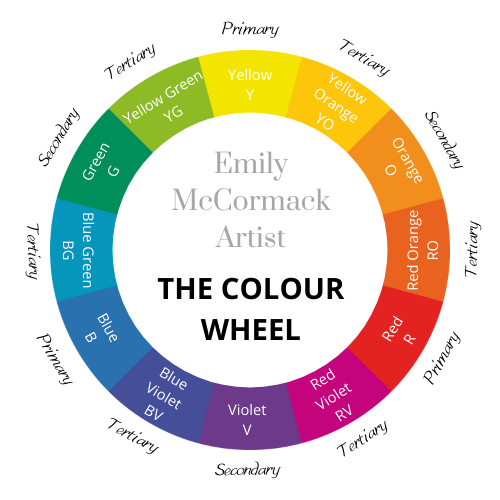
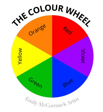
The modern-day colour wheel has 12 SEGMENTS: –
3 Primary
- Red (R)
- Blue (B)
- Yellow (Y)
3 Secondary
- Violet (V)
- Green (G)
- Orange (O)
6 Tertiary
- Red Orange (RO)
- Red Violet (RV)
- Blue Violet (BV)
- Blue Green (BG)
- Yellow Green (YG)
- Yellow Orange (YO)
So, as we previously said, Red, Blue and Yellow, the primary colour’s, cannot be made.
Now, Violet, Green and Orange, the Secondary Colours, on the other hand, are made by mixing equal quantities of 2 primary colours as follows: –
VIOLET = RED + BLUE
WHAT ARE COLOUR COMBINATIONS
Colour combinations can really help to transform your painting style. You can use one single colour and tint or shade it (Monochromatic). You can use colours adjacent to each other in the Colour Wheel such as red, red-violet, violet, blue-violet and blue (harmonious) or you can use opposite colours such as red and green (Complements) …..
Read on for my 5 TOP TIPS…
TOP TIP 1 – MONOCHROMATIC
As mentioned above, this is taking one hue, in other words, one single colour, which you can then:
- LIGHTEN with white to create a TINT; or
- DARKEN with either: –
- black to create a SHADE; or
- it’s complement (opposite number on the colour wheel). So, for: –
- RED you would use GREEN,
- BLUE you would use ORANGE (including UMBERS & SIENNAS),
- YELLOW you would use VIOLET.

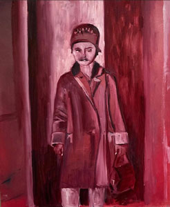
If you would like to try your hand as I did above, then check out works by other Artists such as: –
Kazimir Malevich (1878 – 1935), Josef Albers (1888 – 1976), Ad Reinhardt (1913 – 1967), Agnes Martin (1912-2004) and Gerhard Richter (1935 – ).
TOP TIP 2 – ANALOGOUS OR HARMONIC
So, for this, you would use colours adjacent or beside each other on the Colour Wheel, such as: –
- Red, Violet and Blue; or
- Violet, Blue and Green; or
- Red, Orange and Yellow – and so on….
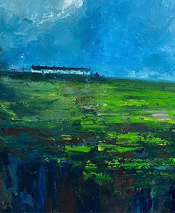
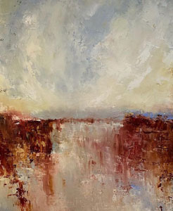
These colours when combined are easy on the eye. So, in the paintings below, I’m using a combination of Violets, Blues and Greens:
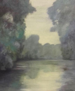
After Monet
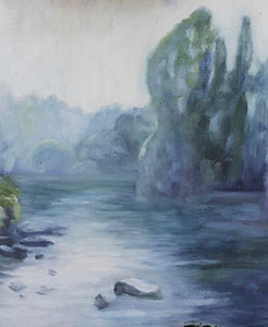
The River Boyne
To learn more on this type of colour combinations, I suggest you take a look at the impressionists and in particular Claude Monet (1840 – 1926) and his Water Lily series of paintings (c.250 no.).
TOP TIP 3 – TRIADIC
This is where you select 3 colours that are equal distance on the colour wheel. For example: –
- Red, Blue and Yellow
- Orange, Violet and Green
This type of palette, can, if you are not careful, result in a very garish and bright painting, that might not be to everyone’s taste. However, used with caution, it can work out very well indeed.
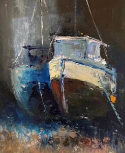
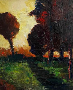
Ships Ahoy Tonight
If this colour palette tickles your fancy, then take a peek at Vermeer’s – The Milkmaid and other works by Warhol, Matisse, Munch and Monet’s earlier works on the Argenteuil.
TOP TIP 4 – COMPLEMENTARY
So, this is where you use colours that are opposite each other on the colour wheel, as follows:
- Red and Green
- Yellow and Violet
- Blue and Orange (include Umbers and Sienna’s)
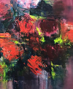
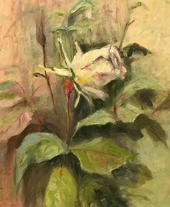
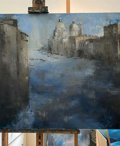
As a rule of thumb though, use one colour predominantly, try not to use 50% strength of each, as they will battle/compete for attention. But again, every rule was made to be broken, so don’t let me stop you.
Other artists to check out for this type of palette include Van Gogh, Picasso, Chagall, Van Eyck and Klee.
TOP TIP 5 – SPLIT COMPLEMENT
Last, but certainly not least, is the Split Complement. Now, for the moment, we are only looking at the primary and secondary colours. However, in future blogs, we will introduce the tertiary colours, these control temperature (i.e. warm and cool) and you will see for yourself, that these will bring even more magic into your paintings. But, for the moment, we are keeping things simple.
So, a split complement, is where you pick your main or dominant colour and instead of choosing the opposite complement, you select the 2 colours on either side of the complement, as follows:
* As always, I am not affiliated with any brands, stores, or persons I may or may not mention and your use of any of these products, links and the like are your own risk and it’s up to you to do your research/homework before you use them. This is just my opinion and experience.
Become an insider, subscribe to receive
Stunning previews of new art, discounts, painting tips and early booking for painting workshops.

