SEEING RED? THE PRIMARY COLOURS
Welcome once again to Emily McCormack-Artist’s blog on all things Oil Painting.
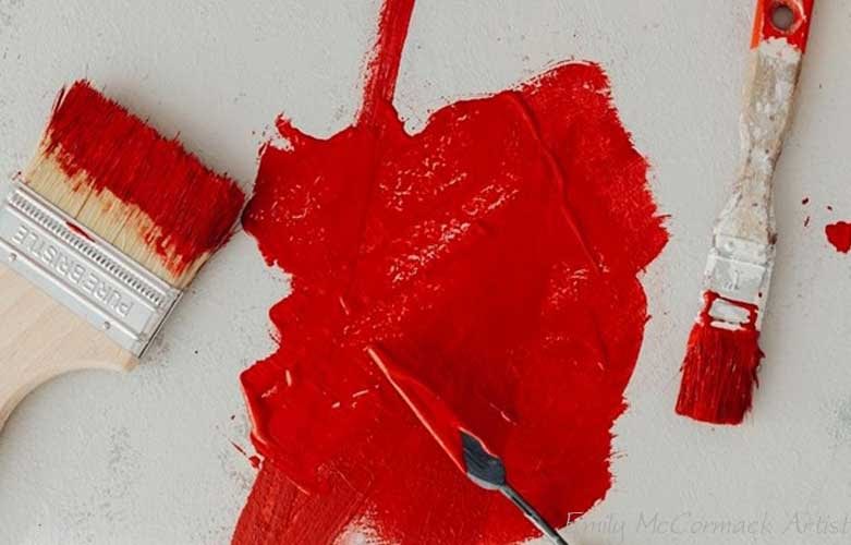
This month and next we are looking at the Primary Colours. So first off, is the colour Red. *
Red is a remarkable colour. It is the first colour after white and black that we see upon being born. It has been with us since prehistoric times, when we used red ochre to paint prehistoric animals and record the outline of our hands.
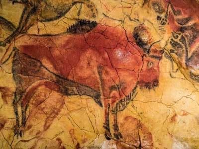
Pre-historic art (also covered pre-historic art post)
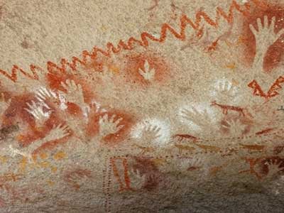
Pre-historic hand paintings
What does the colour Red symbolise?
Red can be used to symbolise passion, love, sex, beauty and courage. But it can also stand for power, aggression, anger, hatred, sacrifice and war. It was also the colour used for revolution, the: –
- French revolution (1789 – 99) & the Reign of Terror;
- Bolshevik revolution (1917);
- Chinese revolution (1949);
- Communist Party, Eastern Europe, Cuba & Vietnam (Wikipedia, 2021).
Cultural Uses
For the Ancient Egyptians, red symbolised life, with a small red amulet being placed in the heart cavity of the dead along with the scarab. It also represented anger, chaos and fire, was intricately linked to the unpredictable god of storms, Set, and when paired with white (the colour of purity) it represented unity and completeness (Hill, 2010, Ancient Egypt Online).
The Chinese have from the Huangdi to the Qin dynasty used red, being one of the 5 elements and represented fire. It was used to symbolise good fortune and joy to the Chinese people. Now, it’s used to celebrate the New Year, holidays, and gatherings. (Nilson, 2019, Gotheburg.com)
The Northern Europeans worshipped the Germanic God, Thor, with his red beard and hair. However, with the rise of Christianity during the Middle Ages, he was transformed into the devil. In addition, red-haired women were reputed to be witches and whores and the poppy became the devil’s flower. (www.pigmentsthroughtheages.com)
The Shades of Red and their uses by Artists
Jessica Stewart notes in her 2018 article ‘The History of the Color Red: From Ancient Paintings to Louboutin Shoes’ for the MyModernMet.com that shades of red, include:
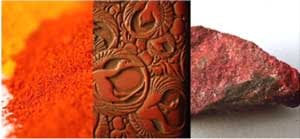
Cinnabar
A toxic mercuric sulphide, used and loved by the ancient Romans / Chinese.
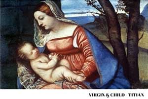
Vermilion
Also toxic, and derived from the powdered mineral, cinnabar, was used by the renaissance artist, Titian, but was later replaced as a mainstream red when cadmium red was invented.
Crimson
Made from the dried bodies of the female insect Kermes which feed on the sap of evergreen oaks.
Carmine
Made from the tiny insects, called the cochineal, that live on the prickly pear in South America and was used by Rembrandt, Vermeer and Velazquez.

“Self-Portrait” c1665
REMBRANDT Van Rijn (1606-1669)
KENWOOD HOUSE, THE IVEAGH BEQUEST, London

The Love Letter (detail)
Johannes Vermeer
c. 1667–1670
Rijksmuseum, Amsterdam

Pope Innocent X (1690)
Velazquez
Red Lead
Also known as Minium was highly toxic as it was made from roasted white lead. It was first invented by the Chinese and used by artists such as Renoir and Van Gogh.

Woman at the Piano (1875)
Pierre-Auguste Renoir (1841–1919)
oil on canvas, 93 × 73.5 cm
Art Institute of Chicago, Chicago, IL. Wikimedia Commons.

Cadmium Red
Cadmium red became commercially available in 1910 and was used by Matisse.
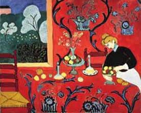
The Dessert: Harmony in red (1908)
Matisse
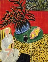
Interior with a black fern (1948)
Matisse
Red Oil Paints Typically Available
This is my table on red oil paints typically available from Evans Art Supplies and other art supply stores.
I have highlighted the reds I use most on my palette:
| Gamblin | ||
|---|---|---|
| Cadmium Red Light | Alizarin Permanent also have Alizarin Crimson | Naphthol Scarlet |
| Cadmium Red Medium | Brown Pink | Perylene Red |
| Cadmium Red Deep | Indian Red | Radiant Red |
| Venetian Red | Naphthol Red | Transparent Earth Red |
| Michael Harding (Extra to above) | ||
|---|---|---|
| Alizarin Claret | Quin Rose Organic | |
| Brilliant Pink | Rose Madder | |
| Crimson Lake | Scarlet Lake | |
| Genuine Chinese Vermilion |
Transparent Oxide Red |
| Old Holland (Extra to above) | ||
|---|---|---|
| Flesh Ochre | Lake Dore Madder | Alizarin Crimson Lake Extra |
| Red Ochre | Ultramarine Red Pink | Ruby Lake |
| English Red | Madder (Geranium) Lake Light Extra / Deep Extra | Scheveningen Red Scarlet |
| Persian Red (Indian) | Golden Barok Red | Vermilion Extra |
| Scheveningen Red Medium & Light & Deep | Scarlet Lake Extra | Old Holland Bright Red |
| Burgundy Wine Red | Schev Rose Deep |
| Winsor Newton (Extra to above) | ||
|---|---|---|
| Bright Red | Rose Dore | |
| Permanent Rose | Rose Madder Genuine | |
| Crimson Hue | Winsor Red | |
| Permanent Carmine | Winsor Red deep |
Tips On Using The Colour Red
- While Matisse’s use of red works well above, you do not need a large amount of red to make an impact because it is an extremely dominate colour and even a small amount will draw the eye.
- Adding an opaque white to red will tend to create a pink, rather than a lighter red. Try a transparent white or a little yellow for a lighter red.
- A pigment that fades when exposed to light will fade faster if used on a white background than on a dark one.
- Pigments that are not permanent are best used full strength, rather than as tints.
- Artist’s quality paints are classified into series, indicated by a number on the tube, costing increasingly more as the pigment becomes more expensive. So, for example, in Winsor & Newton oils, bright red is series one, cadmium red is series four, and carmine is series six.
- Remember that using a complementary colour in this case – green will intensify the colour red.
- Make use of the fact that red appears to ‘advance’ against a green or dark blue, which appear to ‘recede’.
Further Reading
Two really good books on the history and facts about colour include:
- Colour by Victoria Finlay
- The Secret Lives of Colour by Kassia St Clair
In the first by Finlay, she researches colour all around the world and writes about her adventures seeking the truth behind the stories on each colour pigment. For example, she notes that:
- Turner’s use of carmine on “Waves Breaking Against the Waves” – that the carmine used faded. Turner was warned by W&N but he told them to mind their own business.
- She also writes about the Spanish sending several trillion insect bodies by the cochineal fleet of ships from 1575 to supply the European rouge (makeup) industry and textile industry, particularly for cardinal robes.
In the second book, St Clair will regale you with many tales including the Turkish monopoly on the colour Madder, the colour Scarlet and its association with the beheading of Mary Queen of Scot and the Middle Ages Frankish King Charlemagne and his shoes; and the serpent of Saffron Waldon in 1668 and the colour Dragons Blood.
In our next blog we will be looking at colour, the primary colour blue.
Emily McCormack
2021
* As always, I am not affiliated with any brands, stores, or persons I may or may not mention and your use of any of these products, links and the like are your own risk and it’s up to you to do your research/homework before you use them. This is just my opinion and experience.
Become an insider, subscribe to receive
Our regular monthly newsletter, including stunning previews of new art, discounts, painting tips, new blogs and early booking for painting classes.