Welcome 5 Key Steps for Selecting Oil Paints
Welcome to Emily McCormack-Artist’s very first blog on this cold and wintery February 2021.
I know we are all still in Covid19 Lockdown and it’s hard to know when exactly we will be out of it but now is a fantastic time to take stock of your existing painting kit, especially your oil paints. Or perhaps you are a newbie, a beginner and have no clue where to start then this blog will help get you up and running.
Step One – Choosing Your Colour Palette For Oil Painting
Here at Emily McCormack’s Art Studio Workshops, we start off with a basic palette of warm and cool yellows and reds and we also add a blue, a green and a touch of violet :-
| Colour | Warm | Cool |
|---|---|---|
| Yellow | Cadmium Yellow Deep | Cadmium Lemon |
| Red | Cadmium Red Deep | Alizarin Crimson |
| Blue | Ultramarine Blue | |
| Green | Green Sap Green | |
| Violet | Cobalt Violet | |
| We also include a large 200ml tube of Titanium White and Ivory Black. | ||
Optional oil paint colours which are also useful to have in your kit at this early stage are Yellow Ochre or Naples Yellow (Yellow Ochre + White), Prussian or Phthalo Blue, Viridian (a cool green) and Dioxazine Purple (cool).
The reason we limited the painting pallet to just a few oil paint colours is so that the students get used to working with these colours before moving on to the Sienna’s, Umbers, and other available colours out there. It also gives the student time to get comfortable with oil painting as they also have to deal with new brushes, painting surfaces, pallets and mediums which we will also cover over the next few weeks.
Here at the Art Studio, we take a more in-depth look at colour in Workshop Level 4 and Workshop Level 7.
In Workshop Level 4 we spend week 1 on the colour yellow and works by Van Gogh, week 2 on red and works by Klimt, week 3 on blue and works by Munch and Degas and week 4 on black and white and your own self-portrait if you are up for it.
In Workshop Level 7 we look at orange which would also include your Umbers and Sienna’s, purple, green, grey and we do a full recap on colour and we also look at the colour wheel and colour terminology.
Step Two – Selecting Your Brand of Oil Paint
The brand of oil paint we start off with is the student quality of Winsor and Newton which is called Winton. The reason for this is primarily one of economics as a 37ml tube is never more than €5. If it is then you might want to check the front of your tube to see if it’s water-soluble or a griffin alkyd. Water-soluble oil paint uses water as its medium i.e. you don’t need a solvent. Griffin is a fast-drying oil paint that contains an alkyd – I don’t like using it as some brands can be quite smelly but its good to use if you are under pressure and you need your oil painting to dry faster.
As the student continues with their oil painting practice and moves up through the workshop levels we start to introduce different brands and quality of paints.
There are generally two types of oil paint – student and artist or professional quality. Artist quality oil paint is generally more expensive, and the quality is generally much better as they contain more oil pigment and less binders/fillers. Again, if you look at the front of your tube of oil paint it will state if its Artist quality, but you will never see student quality on the label but it’s a given if the word artist is not used.
Some of the brands of oil paint include Windsor & Newton, Old Holland, Michael Harding, Sennerlier, Holbein, Williamsburg and Gamblin. I use a combination of them all as I have plenty of favourites within each brand – but we will take a more in-depth look at this within future blogs.
Step Three – Reading a Tube of Oil Paint
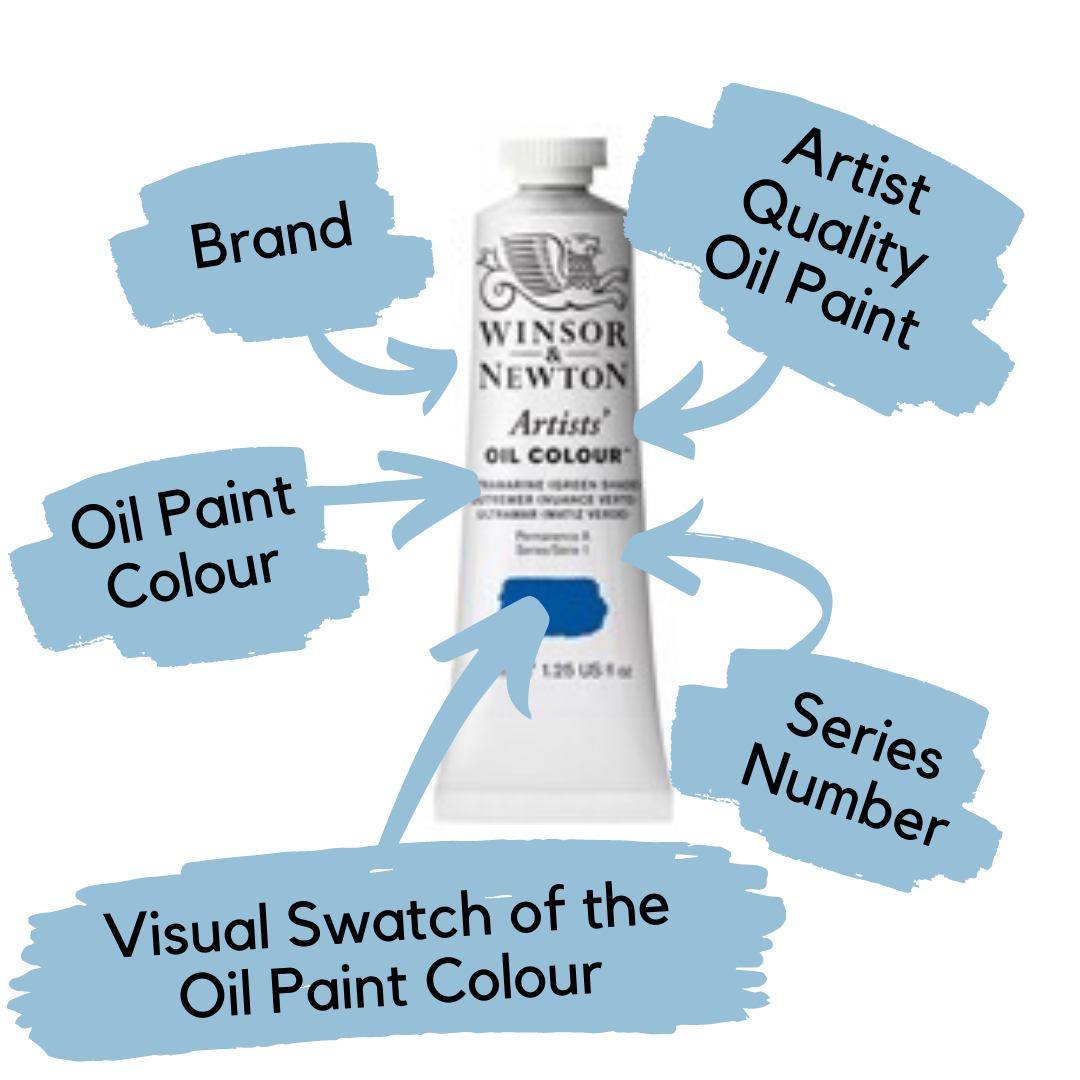
For those of you who have not attended one of our Workshops over the last few years, this is a quick and dirty guide to reading a tube of oil paint:-

The Series Number on the Winton tubes is usually always Series 1 – this is your cheapest brand of paint. Generally, Winsor & Newton will go to Series 4 which will be around €25 for 37ml. Whereas Old Holland can go to series 6 which can be quite expensive. We will come back to this in future blog posts but as a rough guide cobalts and cadmiums will be series 4 or more and will generally be more expensive.
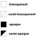
At the back of an oil paint tube, it will either include one of the following symbols or it will actually state if the oil paint is transparent, semi-transparent, opaque or semi-opaque. As your painting skills develop this will become more and more important but for the moment it deals with the optical qualities of the paint – i.e. can you see through it and/or use it for glazing. Examples of transparent oil paint would be Alizarin Crimson, Raw Sienna, Ultramarine Blue and opaque paint would be Cadmium Yellow, Burnt Umber, Cobalt blue and Titanium White.
Step Four – To Go For a Large or Small Tube of Oil Paint
I would recommend if you are, a beginner, to start with small tubes of oil paint (37 – 40ml) and just purchase a large (200ml) tube of Titanium White and Ivory Black. The reason being is that I have witnessed new beginner art students squeezing out large amounts of oil paint and then mixing huge pools of paint which ultimately get contaminated with other colours or they end up mixing a muddy mess of colours and really it’s a total waste of money and time. However, if you are at home and you have a large working pallet or you have been working on your Craft and with oil paints for some time and can roughly gauge what you are going to need then the large tubes of paint are naturally the way to go.
Step Five – Limited or Expanded Oil Painting Palette
Of late and this is for those of you who are more advanced with your painting and colour mixing, I have just been using Titanium White, Ultramarine Blue, Cadmium Red or Bright Red, Transparent Red Oxide or Burnt Sienna and lemon yellow. You could also add if you wanted Yellow Ochre, Alizarin Crimson and ivory black.
By using this limited pallet, I have discovered incredible greys, greens and violets and my overall colour mixing and colour reduction has improved.
Other artists that used limited pallets were Andres Zorn, a Swedish artist of the late 19th century who just used 4 colours – vermilion, ivory black, white and yellow ochre – some recon he used cadmium red instead of vermilion which was toxic – with these colours he could make blue using the black, greens and purples, browns and stunning greys. Rembrandt’s pallet consisted of yellow ochre, burnt sienna, burnt umber, white, black and a red such as cadmium red deep.
With an expanded oil painting pallet, one might include a variety of reds, yellows, greens, blues and oranges. Typical reds that I might use would include alizarin crimson, cadmium red light, cadmium red deep, perylene red, brown-pink and radiant pink. Typical blues would include cobalt blue, ultramarine blue, indigo or Prussian blue, cerulean and/or manganese blue.
Over the next few month’s we will be exploring colour and taking an in-depth look at artists, art movements and oil painting techniques. However, next week we will continue with our look into the oil painting kit and talk brushes….
Emily McCormack
February 2021
Become an insider, subscribe to receive
Stunning previews of new art, discounts, painting tips and early booking for painting workshops.


