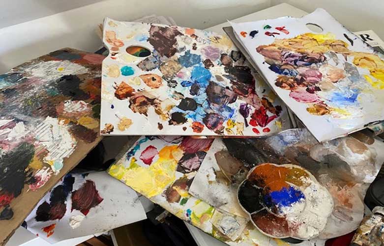
5 WAYS TO LAY OUT YOUR PAINTING PALLET
Before the Easter break, we looked at the Painting Canvas. This week, we are taking a look at the ways you can lay out your Painting Palette. *
There are no hard and fast rules to laying out your oil paints and over time you will each have your own way of doing this, that best suits your own style of painting. But if you are a beginner it is a good idea to have a system because then you can paint without thinking just like driving a car, it becomes an automatic action.
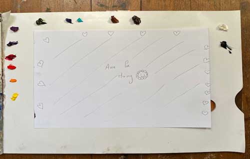
Before you begin make sure you always put your paint colours as close to the edge of the palette as possible that way you will always have plenty of space to mix your colours – like this:-
5 ways to laying out your palette include:
- Black and White Palette
- Primary Palette
- Light to Dark or Dark to Light Palette
- High Key or Modern Palette
- Impressionist, Master and Landscape Palettes
BLACK AND WHITE PALETTE
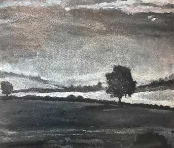
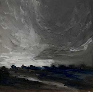
Here at the Painting Workshops we start beginner students off with a black and white palette – just Titanium White and Ivory Black. This is a great way to learn about mixing oil paint and getting an introduction into tone and value without getting bogged down with a lot of colours.
Some of the paintings we do, include:
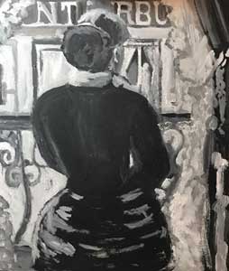
After Caillebotte
We are currently working on a full new Workshop Syllabus which will be for all you out there who are transiting into retirement and will teach you everything you need to know about oil painting. If you would like to know more about this programme or would like to be added to the waiting list then just subscribe to our mailing list and we will keep you posted.
PRIMARY PALETTE
This can be used by beginners but more especially by those of you who are more advance in your painting skills.
With this palette you just use the Primary Colours – a Red, a Yellow and a Blue. But the trick is to decide on what red, yellow and blue to use.
I paint a lot with alizarin crimson (cool), ultramarine blue (warm) and yellow ochre (warm) or cadmium yellow light (cool). You might decide to try a bright red or cadmium red light (warm), a cobalt blue (warm) and hansa yellow (cool). It’s a terrific way of getting to know your colours including opaque and transparent colours, mixes and colour temperature with only having to deal with a few colours. You could add Titanium White or Ivory Black to practice your tints (where white is added) and your shades (where black is added).
LIGHT TO DARK OR DARK TO LIGHT (CLASSICAL) PALETTE
With this palette you lay out in the following order – yellows, reds, violets, greens, blues, browns, black and titanium white. You can also put the white first. The dark to light is just in the opposite way starting with your blacks, browns, blues and so on. You can expand this palette to use a warm and cool version of each hue or colour. So, for the yellows you could have hansa yellow (cool) and cadmium yellow medium (warm) and the blues you could have phthalo blue (warm) and cobalt turquoise (cool).
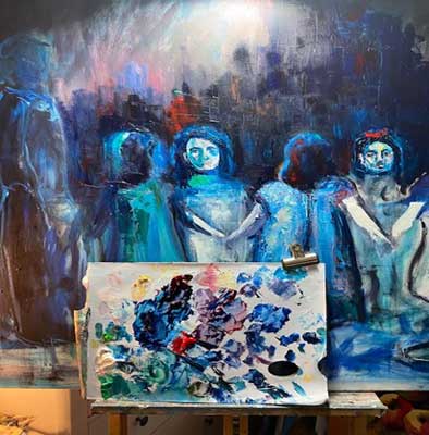
The following is an image of my palette and a work in progress stage of a recent painting I just completed entitled “Ring a Ring A Rosie” it’s 4ft x 3ft and part of the Old Ireland Series I’m currently working on. The colours I used were green (emerald and bright green), yellow (naples yellow), red (alizarin crimson and cadmium red) and blue (ultramarine and phthalo blue).
The work in progress and completed images if you would like to see them are posted on Facebook and Instagram.
HIGH KEY OR MODERN PALETTE
The high key or modern palette began at the end of the nineteenth century with new developments in the pharmaceutical, dyeing and printing industries where new chemical pigments were produced with greater transparency and intensity when tinted with white. Such colours typically included hansa yellows, naphthol scarlet, quinacridone red or violet, phthalo blue, manganese blue and phthalo (emerald) green.
If you wanted to experiment you could also try using the colours in the printer palette such as is yellow, cyan, magenta and black.
IMPRESSIONIST, MASTER AND LANDSCAPE PALETTES
If you are an intermediate or advanced painter then you might like to be a bit more adventurous and try some of the following palette’s as shown in more detail on the Gamblin Artist Website:
- Impressionist Palette
Cadmium Yellow Light (cool), Cadmium Yellow Medium (warm), Cadmium Red Light (Warm), Alizarin Crimson (cool), Ultramarine Blue (warm), Cerulean Blue (cool) Veridian (Cool) & Flake White and Ivory Black.
- Masters Palette
Transparent Earth Yellow, Transparent Earth Orange, Transparent Earth Red, Asphaltum, Terre Verte, Naples Yellow, Yellow Ochre, Cerulean Blue, Ultramarine blue, Cobalt Green, Burnt Sienna, Venetian Red, Ivory Black.
- Landscape Palette
Hansa Yellow light, Cadmium Yellow Medium, Naples Yellow, Yellow Ochre, Cadmium Orange, Cadmium Red Light, Alizarin Crimson, Ultramarine Violet, Ultramarine blue, Cobalt Blue, Manganese Blue, Cadmium Green, Sap Green, Viridian, Van Dyke Brown and Flake white.
As you can see, there are many ways to lay out your palette. If you would like to know more about other palettes such as the limited palette or the Zorn palette we previously touched on this in “5 key steps for selecting oil paints”. For those of you who are more advanced in your painting you can research other palettes / colour schemes such as monochromatic, analogous, triadic, complementary, tetrad or split complementary. Again for you beginners, I will be covering and simplifying all of this in future blogs.
In our next blog post, which will be in two weeks-time, as we are getting into the Summer months, we will be taking an introductory look at colour mixing.
Until then enjoy the April Showers and the longer evenings. Keep painting.
Emily McCormack 2021
* As always, I am not affiliated with any brands, stores, or persons I may or may not mention and your use of any of these products, links and the like are your own risk and it’s up to you to do your research/homework before you use them. This is just my opinion and experience.
Become an insider, subscribe to receive
Stunning previews of new art, discounts, painting tips and early booking for painting workshops.


